
TAKE A NURSE
Author: Mike Pernice, Founder · Last updated: September 2026
Take a Nurse is a nurse-driven, patient-focused small business in Pittsburgh, PA that advocates for independent individuals who need help understanding and navigating their medical care. The Stoop designed its visual identity from the mark up — a logo system built around a stethoscope that forms the N and resolves into a heart, five approved color variants, a seven-color palette, a two-typeface type system, business cards, letterhead, and a brand identity guide — and is now building the website on the same system.
The Challenge
Take a Nurse grew out of founder Kathy Fadgen's own experience. Her out-of-town parents were going to medical appointments without her, and unknown treatment plans and medication changes led to stress, delayed care, and unnecessary emergency room visits. The brand had to feel like the service itself — a calm, trusted advocate — and it had to hold up everywhere a healthcare brand shows up: a website header, a business card, an embroidered uniform, a form, a phone screen. It also needed rules so it stays consistent no matter who produces the next piece. The Stoop delivered the full system: the mark, the lockups, the colors, the type, the stationery, and the guide that governs them.
The Logo System
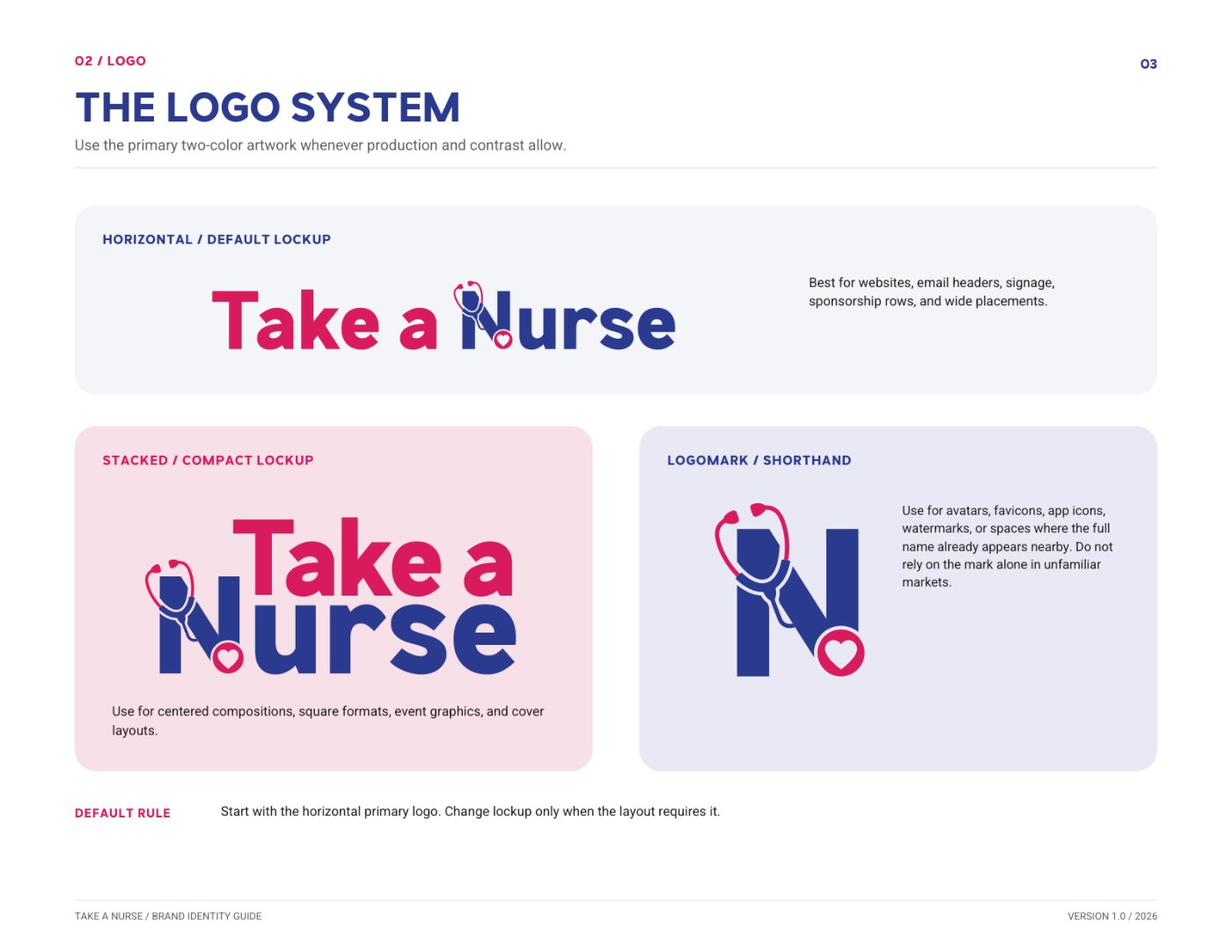
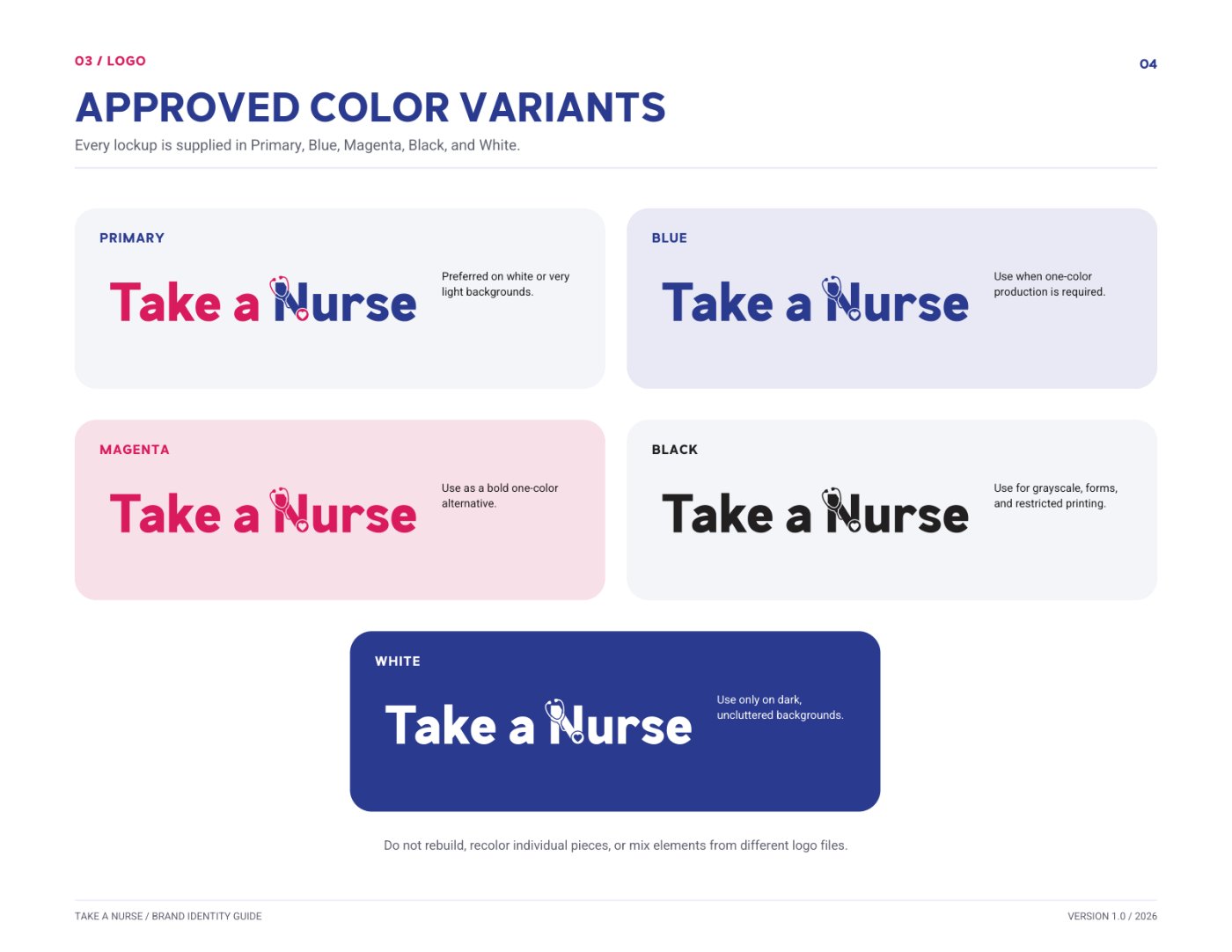
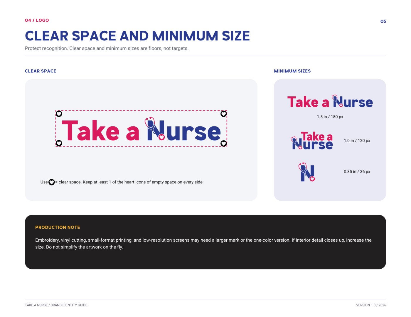
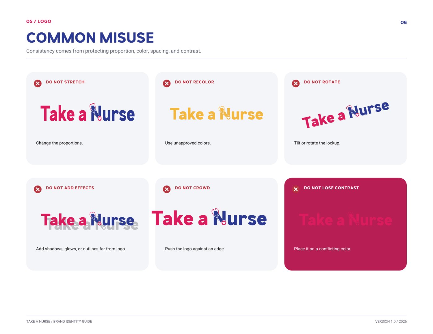
The identity is built around one idea: a stethoscope that draws the N and resolves into a heart. The Stoop delivered it as three lockups — a horizontal default for websites, email headers, and signage; a stacked version for square formats and event graphics; and a standalone logomark for avatars, favicons, and watermarks — each supplied in Primary two-color, Blue, Magenta, Black, and White, with clear-space and minimum-size rules so the mark survives embroidery, vinyl, and small screens.




Need a mark that works on a business card and a building?
Start Your LogoPalette & Type System
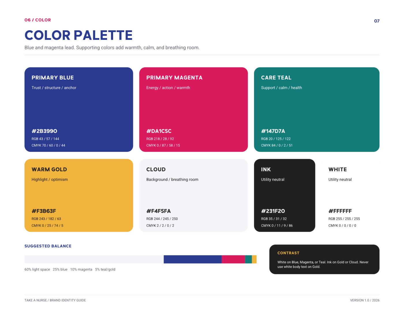
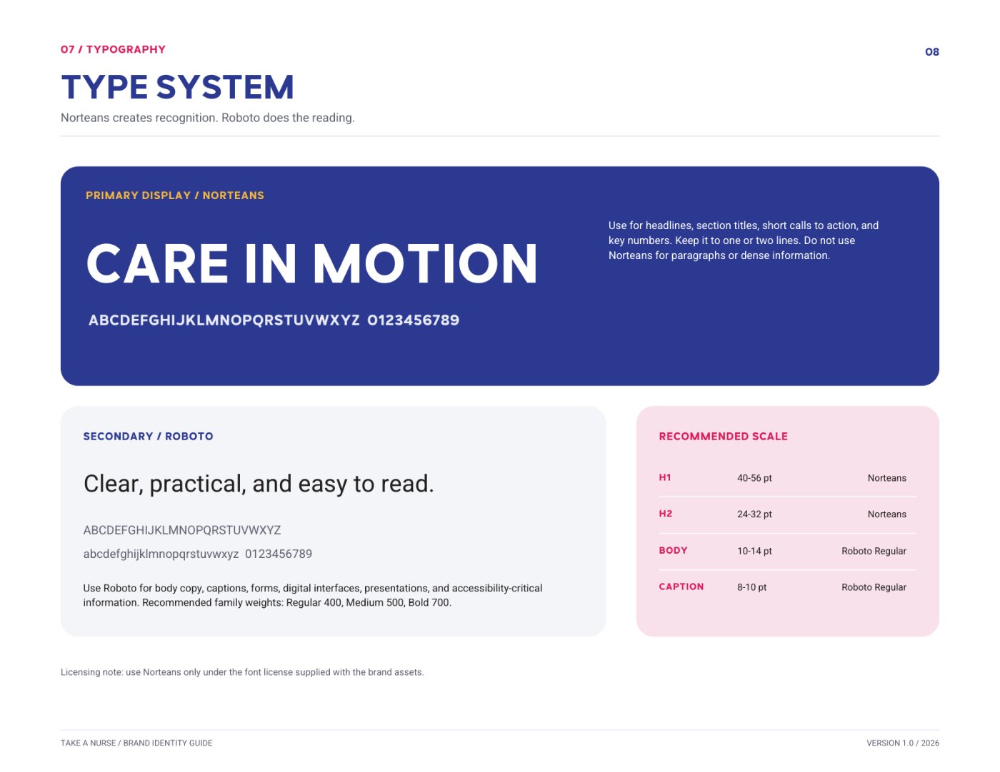
Blue carries trust and structure; magenta carries energy and warmth. Care Teal, Warm Gold, Cloud, and Ink support them, each with a defined role and hex, RGB, and CMYK values so print and digital match. Norteans handles headlines and key numbers; Roboto does the reading, with a recommended scale from H1 to captions and a misuse page that protects proportion, color, spacing, and contrast.
#2B3990
#DA1C5C
#147D7A
#F3B63F
#F4F5FA
#231F20
#FFFFFF
Want a palette and type system your whole team can actually follow?
Build Your Brand SystemBusiness Cards & Letterhead
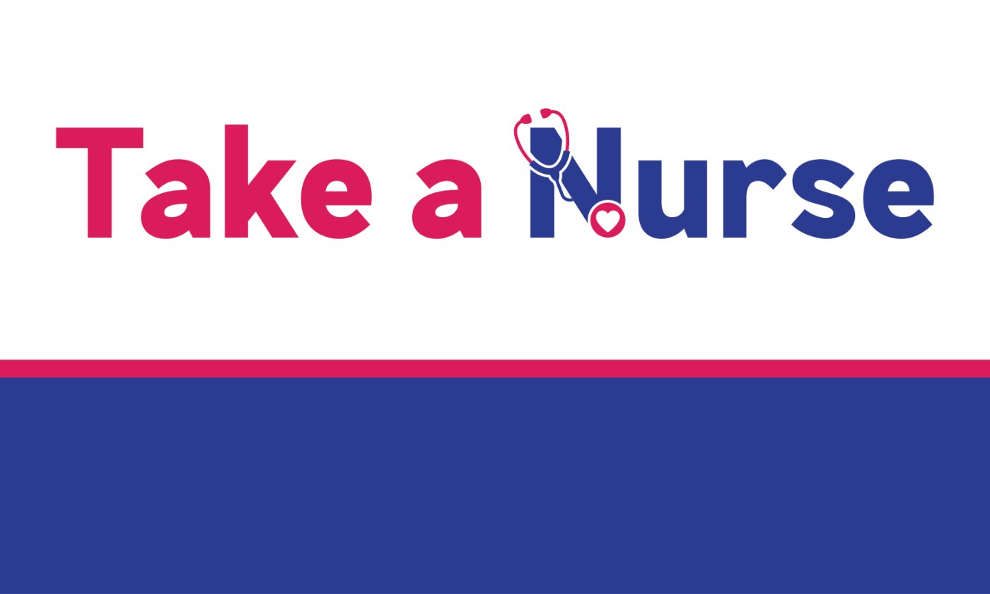
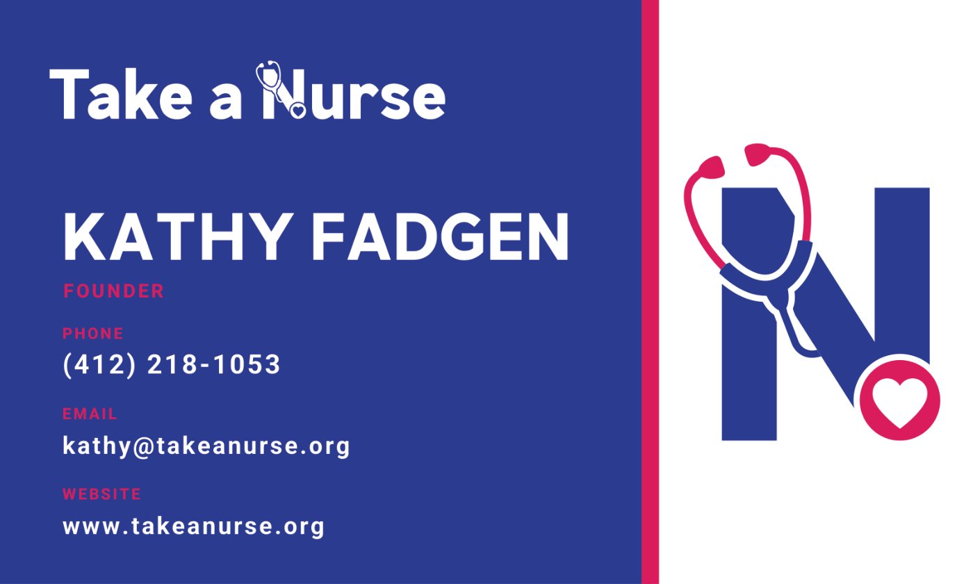
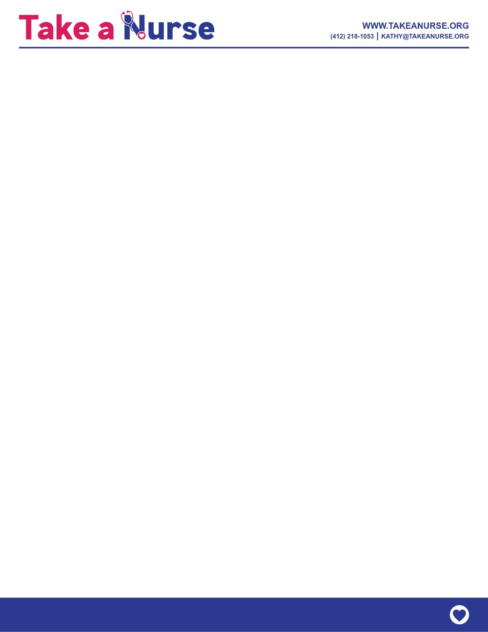
The first pieces built on the system: a two-sided business card that puts the horizontal lockup and magenta accent on the front and the logomark, contact details, and Norteans name treatment on the back, plus a letterhead that carries the header and footer bar onto every printed page.
Need stationery that matches the brand you just built?
Design Your StationeryOur Process
The Mark
Designed the stethoscope-and-heart N as the single idea the whole identity hangs on, then set the wordmark around it.
Lockups & Variants
Built horizontal, stacked, and logomark lockups and supplied each in five approved color variants, with clear-space and minimum-size floors.
Color & Type
Defined a seven-color palette with print and digital values, paired Norteans with Roboto, and set a recommended type scale.
Stationery & Guide
Produced print-ready business cards and letterhead, then documented everything in a nine-page brand identity guide.
A System, Not Just a Logo
Take a Nurse now has one mark that scales from a favicon to signage, a palette and type pairing that match across print and screen, stationery ready for the printer, and a guide that lets anyone — a printer, an embroiderer, a web developer — produce on-brand work without rebuilding or guessing. The identity is in use, and The Stoop is now building the Take a Nurse website on the same system.
Need a brand that holds up everywhere?
Let's build the whole system, mark to guidelines.